For most of us, there’s an obvious answer. Numbers alone are rarely intuitive, but a well-chosen analogy can transform the abstract into the tangible. This is at the heart of one of the challenges we face in science communication: how do we make complex ideas resonate with different audiences?
In this post, I’ll use the acre-foot – a peculiar and often-criticized unit of measurement – as a case study to explore (a) why the choice of units matter, (b) why it’s so hard to make numbers make sense, and (c) what we can learn from the acre-foot to improve how we share science.
Let’s dive in.
The case against the acre-foot
One acre-foot (abbreviated ac-ft) is very simply defined as the volume that is equal to one foot of depth over one acre of land and, as far as I know, it is exclusively used to measure a volume of water. Over the years, I’ve seen and heard many criticisms of the use of the acre-foot and the US customary system of measure more broadly, of course. Since I primarily engage with the international scientific community, this is where I most commonly hear it, but I do have a sense that this criticism (…contempt, derision, disdain…) is more widespread than that. As a scientist, it doesn’t bother me because I use the metric system in my research, and as an engineer it doesn’t bother me because I am quite comfortable performing unit conversion. But as a red-blooded American… well, you know how defensive we can get in the name of “patriotism” (or something).
I’m clearly joking, as you’ll see. And anyway, despite the title, this post isn’t meant to be a defense of US customary units (or “English units”, or “the imperial system”, both of which are incorrect, by the by). Rather, this is a call to those critics to consider a more nuanced and pragmatic view of the issue of unit selection. In other words, let’s not throw the proverbial baby out with the swimming pool water just yet. But I’m getting ahead of myself.
Here’s the thing: on the surface, of course people are right to criticize the acre-foot. Neither acres nor feet make any sense in our modern scientific age, really: the acre originated as the approximate unit of land that a yoke of oxen could plow in a day and, as we all know from the name, the foot has varied, ancient, anthropometric origins… but this isn’t a history lesson, and if you’re reading this I trust you can hold your own against me in a “who reads more Wikipedia” contest. The point is that we’ve diligently and meticulously defined and redefined and redefined units in the international system of units (“SI units” or “the metric system”), which includes units of measure such as the meter and the gram, and we should use them for science.
I agree.
I grew up in the US, so as hard as it is for me to intuitively grasp how much I weigh in kilograms, or how hot (or cold?) I’ll be at 20 degrees Celsius, or what a stream looks like when it’s flowing at a cubic meter per second, I still agree that these are the units we should use for science and I use them in my own research. This, however, is the entirety of the argument against the use of the acre-foot: it’s simply not well-known to the vast majority of humans on planet earth, and it isn’t perhaps as standardized as the alternative (i.e., the cubic meter). While it is certainly a valid argument from a scientific perspective, let’s remind ourselves that most humans aren’t scientists and in doing so explore some other critical perspectives.
The case for the acre-foot
Allow me to briefly remind you that an acre is defined as 43,560 square feet (which, by the way, makes an acre-foot equal to 43,560 cubic feet) and that this is about the size of an American football field without its end zones, or somewhere near one half the size of a professional soccer pitch. A US survey foot is roughly 0.3048 meters, so an acre-foot is roughly equivalent to 1233.48 cubic meters. This is not close to a nice round number, to be sure, and I can understand the frustration that someone who is familiar with cubic meters might have at being forced to do the mental unit-conversion-math during a presentation at a scientific conference… just for, uh, sake of example (ok, yes, I may be subtweeting an AGU24 talk or two, but no shade).
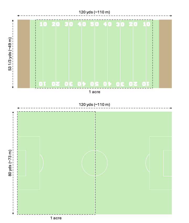
A visual comparison of an acre to an American football field and a standard soccer pitch (to scale) [original content].
Admittedly, the acre-foot is a unique unit. I’ve been racking my brain and perusing the list of unusual units of measurement to think of another unit that combines two different units of measure for the same dimension1 – length in this case – and I’ve only come up with two: the board foot and the hectare-meter – the latter of which I have seen in the scientific literature as, I believe, merely an SI version of the acre-foot. So, carpentry aside, it appears that this may be unique to the field of hydrology where, perhaps, we simply have a need for such a unit – e.g., to convey how much water there is when it floods in a way that humans understand. This is really the fundamental utility of such a unit: someone without scientific training can visualize what you mean (with a modicum of explanation, if necessary) when you talk about an acre-foot of water.
Here is also where the criticism breaks down a bit, because an acre can be somewhat2 neatly defined in square feet, so multiplying an acre by a foot simply yields cubic feet. If we discount the spurious origins of the foot and consider that it, too, has been modernly redefined and standardized (the international survey foot is exactly 0.3048 meters), then the ease of precise conversion to SI units means that, depending on the context, we shouldn’t worry too much about error propagation.
My point is this: while there are strong and sound arguments for using the metric system, and unit conversions have historically been the root cause of both minor oopsies and major catastrophies alike, in many cases it actually isn’t a huge issue if we use something like US customary units in practice. Any engineer worth their salt should be capable of performing these conversions as necessary, triple-checking their math, and (these days) effectively using software to avoid needing to do either of these things in the first place. Like the cubic foot, the acre-foot is commonly used in the US engineering industry, and since pirates prevented metrification in the US, we’re unlikely to see that change any time soon.
Briefly, it is also worth mentioning that there are some other practical considerations we need to make here. Perhaps the most obvious among these is the use of units like acre-feet in regulatory language like the Colorado River Compact. Historical and institutional momentum play a large role here, and in all likelihood this is just something that we’ll have to continue dealing with whether we like it or not. Moving on.
Context is everything
You may have already noticed, but we’re actually circling around a central theme here, which is this: different units of measure are contextually intuitive - i.e., they are intuitive based on where you grew up (the US vs nearly anywhere else) or, more generally, they are intuitive based on your life experiences. If you’ve never seen an Olympic swimming pool or an American football field, then neither the pool nor the football field analogy are going to be effective examples to use to bring things into perspective, regardless of the units against which we’re trying to compare.
And this isn’t unique to the US, of course. If you grew up in England, you may still be measuring things in stone, pounds, and ounces, despite the formal beginnings of metrification some six decades ago. While the metric system did either kill off or standardize many traditional units of measure,3 there are some that have stubbornly stuck around, particularly in agriculture and trade, including the maund (a unit of mass in Southern and Central Asia), the hand (used universally and exclusively for measuring equines) and the cuerda (used in some Spanish speaking countries as, confusingly, either a unit of length, area, or volume).
On top of this, the magnitude of the values we use also matters, and this is intrinsically tied to the units we choose. Let’s explore this a bit more in the context of human psychology.
The psychology of numbers
So far we’ve established that, on one hand, standards are objectively good for science, and on the other that we live in a world where certain things are the way that they are and yelling at clouds doesn’t really get us anywhere. Let’s turn our attention now to some more fundamental truths about the way that humans perceive both numbers and scales, because I think this is where things get really interesting.4
If you haven’t heard it in a while (or ever), do yourself a favor and go listen to the classic Radiolab episode from 2009 called Numbers. Apart from being an example of a perfect podcast episode (IMHO, anyway), it features a fascinating discussion about how humans naturally relate to numbers logarithmically. As it turns out, this is especially true5 for those without formal math training, though I can’t help but wonder if even trained minds are constantly battling that underlying “lizard brain” math.
As a practical example of this idea, consider how we describe earthquakes using the Richter scale. The scale is logarithmic, so an earthquake with a magnitude of 6 releases ten times the energy of a magnitude 5, and a magnitude 7 releases ten times the energy of a 6. One could argue that the Richter scale works in part because it mirrors how humans instinctively process numbers: proportionally rather than absolutely. The proportional difference between two numbers is far more innately obvious to us than the absolute difference, such that the gap between 1 and 2 feels larger than the gap between 8 and 9. Extrapolate this into the realm of thousands, millions, or billions, and the absolute difference between two adjacent numbers effectively becomes meaningless to us. If you don’t believe me, try looking around and estimating, to the nearest person, the number of people in attendance the next time you’re at a concert venue or a sporting event. I guarantee you won’t be debating between 12,304 and 12,305; rather, your answer will be something to the effect of “more than a thousand but less than a million”.
This brings us to the next issue humans have with numbers, which is slightly different but highly related: we lack the ability to truly conceive of large numbers.6 Try for a moment to imagine one million of something. For example, what would one million humans look like, all in one place? As it turns out, it’s difficult to find photos of so many people gathered together, as even the largest crowds top out at around 250,000 by many accounts (and it gets increasingly difficult to verify such claims), but the crowd at Obama’s inauguration address is likely one of them. And if I asked you how many people were in that photo and gave you three choices – (a) 100,000, (b) 500,000, or (c) 1,000,000 – would you feel confident in your answer? I, for one, would not, and this illustrates my point, which is that after a certain point a large number is no longer useful for conveying anything other than the simple fact that it is a large number.7 This is also somewhat related to the so-called law of truly large numbers, which to me is the reason people continue to play the lottery even after knowing the odds. They may know the odds, but they don’t understand them (or as Penn Jillette put it, “Million-to-one odds happen eight times a day in New York”).
Before we move on, there is one more related point of discussion that I can’t skip over, and that is how scale impacts the ability of humans to conceive of quantities. In short, we can process information better when it aligns with familiar, human-scale experiences. Analogies like “Olympic swimming pools” and “dump truck loads” make abstract volumes easier to grasp because they provide a tangible, proportional reference point. Similarly, just as logarithmic scales like the Richter scale mirror how we instinctively process proportional differences, human-scale analogies bridge the gap between abstract numbers and our everyday experiences.
Naturally, this discussion about how we perceive numbers leads us right into a discussion about how we might use this knowledge for good… or perhaps for evil.
The ethics of choosing the right units
I read an article in Nature recently that contains a figure conveying changes in streamflow timing, the units of which are “months per year” (month yr-1). These units alone are not necessarily problematic, but when you see that the scale ranges from -0.02 to 0.02 month yr-1, you might be tempted to agree with me (based on all the above) that this was probably not the best choice of units in this case. Setting aside the fact that a month is not even a consistent measure of time, using another analogous unit in this example would yield a nice integer value (for example, using days per decade instead would yield a range of about -300 to 300). Now, while I think this example is more careless than unethical, things are not always so.
There are myriad ways to bias the presentation of numbers whether purposely or accidentally, but one of the more annoying ones to me personally is simply choosing units that make your numbers look bigger or smaller to meet your aims. This can range from the relatively innocuous such as reporting clean water produced in billions of liters or mineral stocks in trillions of grams to the more nefarious such as comparing bottled water consumption to total groundwater withdrawals (i.e., using a very large denominator) to make said consumption seem insigificant.
Even the intentional exclusion of numbers can be highly unethical. A perfect example of this is the way in which conservative US politicians have swayed public opinion by repeatedly saying that we spend “too much” on foreign aid, which has led to the widespread belief that US foreign aid represents 25% of the federal budget when it is actually less than 1%.8
Some of this can be “justified” in the context of marketing or nudge theory, or as an innocent attempt to put things into perspective (as we’ve discussed at length), but I would argue that a lot of it simply unethical, if to varying degrees. If you’re in the business of marketing or policy-making my guess is you’ll continue doing what you want no matter what I say, but assuming I’ve convinced you to keep ethics in mind when presenting your numbers (and I hope it didn’t take much convincing), let’s take a moment to think more generally about effective science communication.
What we can learn from science communication experts
My high school physics teacher hated Bill Nye (his words). I have to believe this was because he was a legitimate physicist who retired to pursue his other passion of teaching (and who, by the way, gained my eternal gratitude by introducing me to the writings of Richard Feynman). To him, I can imagine that Nye was oversimplifying concepts, downplaying the rigor of physics, and simply “dumbing things down” to an unacceptable degree. But to me, who grew up not just watching but captivated by Bill Nye the Science Guy, Bill Nye was (in hindsight) simply another in a line of high-profile science communicators who truly understood how to get around the burden of knowledge – a tidy explanation for the “disparity between good intentions and bad results” when it comes to science education. Regardless of what my teacher thought about him, as a protégé of Carl Sagan and a predecessor to Neil DeGrasse Tyson, Bill Nye impacted an entire generation of would-be scientists and continues to lead the fight against climate science misinformation.
But my views on science communication haven’t only been influenced by the likes of Bill Nye and Richard Feynman. I’ve learned a lot by simply paying attention to what works and what doesn’t. My engineering consulting career in particular taught me many things, but perhaps above all it helped me refine my ability to convey complex technical information to general audiences. As a result, I’d like to think of myself as a decent science communicator, but I’ll still readily admit that I’m not an expert and have a lot to learn.
There is an abundance of good information out there on the subject of science communication, including this list from the American Society of Cell Biologists (ASCB) Communication Toolkit. The first tip on that page is effectively “Know your audience”, which seems pretty on point here. In my experience, we could probably rephrase this as “Consider your audience”, since I’ve listened to talks where it seemed pretty clear that I, the Audience Member, was not even on the list of priorities when the slides were thrown together. Either way, by attempting to understand how your audience will perceive whatever it is you’re presenting to them, in all likelihood your key points will be far better received.
Consider the American farmer as an audience, for example, simply because it’s one with which I have some familiarity. It’s true that small farms are disappearing but, despite what many people seem to think, there are still a lot of family farms out there. Trust me: I’ve spent countless hours traveling around farm country9 – whether knocking on doors in an attempt to get land access for field work,10 delivering presentations at multi-day workshops, or helping lead discussions at community open house meetings – and if at any time I started throwing “hectares” and “meters” around, I’d run the risk of losing the room (and perhaps my job), because farmers in the US are familiar with acres and feet. That’s just the reality. Put aside whatever you might think about industrial agriculture and the completely ineffective ways we are trying to reduce its environmental impact,11 because to communicate with your audience (whoever they are) in a relatable way is to put your best foot forward and set yourself up to make the biggest impact. This is as true for farmers as it is for policymakers, schoolchildren, or the international scientific audience at your AGU meeting presentation.
I certainly learned a lot the hard way by making mistakes of my own and, at times, alienating entire segments of my audience, but I learned the most by observing how more experienced communicators dealt with these crowds. I’m thinking of those working in extension or outreach, or those who have simply had years of experience running public meetings. I can only describe what they do as a form of adept code-switching, and I think it’s something more scientists and engineers really need to work on. While code-switching can be a double-edged sword and is tantamount to pandering if done poorly, doing it well is truly an invaluable skill. Just remember: it’s not about “dumbing down” your message, but rather meeting your audience where they are. And doing the opposite – for example, using jargon because you think it makes you sound smart or authoritative – can be equally alienating.
I may be a little off track here, but I think these are incredibly important things to think about. To summarize, here are what I think are the five most important things you can do as a scientist to help your audience digest quantitative results:
- Consider your audience and tailor your units and analogies to the intellectual and cultural context
- Use visual aids and contextualize abstract quantities – for example, putting the size of an acre in context
- Use dual units when appropriate – for example, “1 acre-foot ≈ 1,200 cubic meters” – to help bridge contextual gaps
- Prioritize proportionality and small magnitudes in presenting large quantities and changes over time
- Simplify without oversimplifying to avoid distorting the science or coming off as pandering
If I’m talking about flooding and I’m in the US, I believe that using the acre-foot instead of the cubic meter checks all these boxes. My audience is generally going to be familiar with these units :ballot_box_with_check:, I can easily use a football field to conceptualize an acre :ballot_box_with_check:, I can equate an acre-foot to cubic feet or cubic meters for any international outliers in the crowd :ballot_box_with_check:, it allows me to use smaller numbers than I would with something like gallons :ballot_box_with_check:, and since it’s a common unit, I don’t come off as pandering or condescending like I might if I tried to use something like “grain bins” or “corn fields” :ballot_box_with_check:.
What in God's holy name are you blathering about?
I’ll tell you what I’m blathering about! My point is not that the acre-foot is a “good” unit, nor is it that you need to use two completely different languages or sets of math in your research. As scientists, we necessarily suffer from the burden of knowledge, so we present numbers with which we are all too familiar without considering whether they actually make sense to our audience. We also have an ethical responsibility to communicate our findings in an understandable, replicable way. We must not forget that publishing papers is not about increasing our H-index; that presenting at a conference is not about padding the stats on our CVs; and that holding a public forum is not about meeting the requirements of a contract. If you work in science (and teaching and/or research in particular), chances are you are more passionate about your work than you are about your paycheck – but to what end?
As an advocate of open science, I believe that it is our responsibility to make science accessible in every sense of the word. This obviously means continuing the move toward open access publications, sharing our data, using visual abstracts, and all the rest. But more fundamentally, it means giving thoughtful consideration to how we present our messages in order to achieve balance between accuracy, completeness, integrity, and comprehension. It’s a tough balance to strike, for sure, but I hope doing something as simple as thinking carefully about our choice of units can help us get a little closer.
So, the next time you’re presenting your results, consider putting them in context. If you’re debating between using “28 million acre-feet”, “35 billion cubic meters”, and “10 trillion gallons”, well, you’re simply having the wrong debate. Instead: about how many Lake Meads is that?12
And let’s embrace the swimming pool, the dump truck, and the acre-foot for what they are: flawed, imprecise, arbitrary, yet highly intuitive ways to convey the idea of “volume”.
I do this for fun, but if you enjoyed reading this (and without ads!), consider buying me a coffee to help fuel my next post :coffee:
-
Something like the kilowatt-hour doesn’t count because kilowatts and hours are two different dimensions (power and time). Also, I’m not including the oft-used acre-inch because it’s not fundamentally different from an acre-foot. ↩
-
I say “somewhat” because the square root of 43,560 is not an integer - i.e., an acre is not “neatly” defined as a square with sides x feet in length, as is a hectare (100 m x 100 m). ↩
-
Let’s have a moment of silence for my personal favorite traditional units of measure that were killed by the metric system: the pood and the batman. ↩
-
I couldn’t find a natural place for these, but somewhere in here I had to drop links to my two favorite XKCD comics about large numbers. ↩
-
Here’s a pop-science version in case you hit a paywall. ↩
-
Compounding this difficulty is anchoring bias, where our initial reference point—-or “anchor”—-skews our perception of a number’s true magnitude. For example, if I tell you that the crowd at Obama’s inauguration was reported as “more than 200,000,” you’re likely to unconsciously use that figure as a baseline for any further guesses. Whether the actual count was closer to 500,000 or 1,000,000 becomes harder to conceptualize because your mind has already latched onto the first number it encountered. This underscores the importance of carefully choosing reference points in science communication, as they can significantly shape how audiences perceive and interpret data. ↩
-
The same, I believe, goes for very small numbers as well. ↩
-
This is obviously big if true, because it means the intentionally deceptive reporting of numbers by politicians (and the subsequent failure in critical thinking by voters) likely plays a role in who gets elected to office. ↩
-
Mostly in southern Minnesota, northern Iowa, western Wisconsin, and southern Ontario, but also a bit in North and South Dakota, Kansas, Nebraska, Colorado, California, Quebec… and even a bit in places like Ecuador and Slovakia. I’d consider myself a casual agritourist. ↩
-
If you happen to be someone who in any way oversees H/H modeling projects, I beg of you: send your modelers into the field. Even if only for one day, seeing things on the ground is the most valuable perspective a modeler can have. You’ll end up with better models that are more accurate and have the necessary details in the right places. ↩
-
Just for the record: in my opinion, (small) farmers are no more responsible for being caught in a broken system than are doctors or teachers. We all need to set our sights higher and follow the money to the sources of these problems. ↩
-
Answer: that’s about the volume of one Lake Mead… at least when it was full (too soon?). ↩