Out of Bounds, On Purpose
Replicating matplotlib’s extended colorbars in R with legendry
Published:
Data visualization as an art
I felt the need to include this brief preamble for one reason:1 to acknowledge that data visualization is often (but not always) more art than science. This will actually be my first in a series of posts on this subject, and we’ll cover some broader topics later.
A perfect and ubiquitous example of where data visualization can go wrong is with color scales: we can easily churn through a long list of palettes to find one that makes a figure “pop”—but if the encoding implies a numeric story the data don’t support, the plot becomes persuasive in the wrong way. My rule of thumb is that the figure itself should carry the burden of correct interpretation: captions should add context, not rescue an ambiguous encoding (“let the plot do the work”). So it behooves me to be constantly on the lookout for small, concrete tricks that make a visual more intuitive. This post is about one such trick.
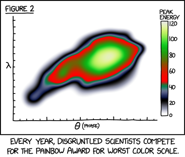
Source: xkcd, of course</a>
Visualizing out-of-bounds (OOB) data using R
Let’s say you want to plot some data, and let’s say that data has a relatively “long-tailed” distribution. This need not even necessarily be non-normally distributed data, but often this is also the case. There are many ways to visualize this kind of data and, obviously, the best ways will often depend upon the context. But instead of talking circles around this, let me provide an example.
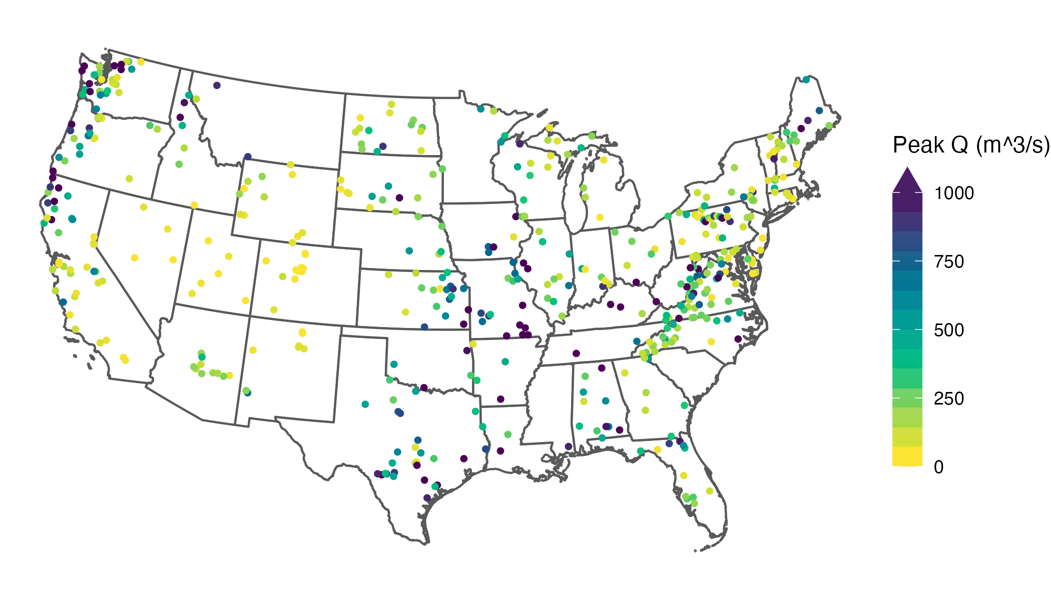
Let’s look at some streamflow data. Without getting into details (because they are irrelevant to the substance of this post), I’ve extracted the largest observed streamflow values between 1981 and 2020 for 494 streams and rivers across the contiguous US.2 Here’s what the distribution of these values looks like:
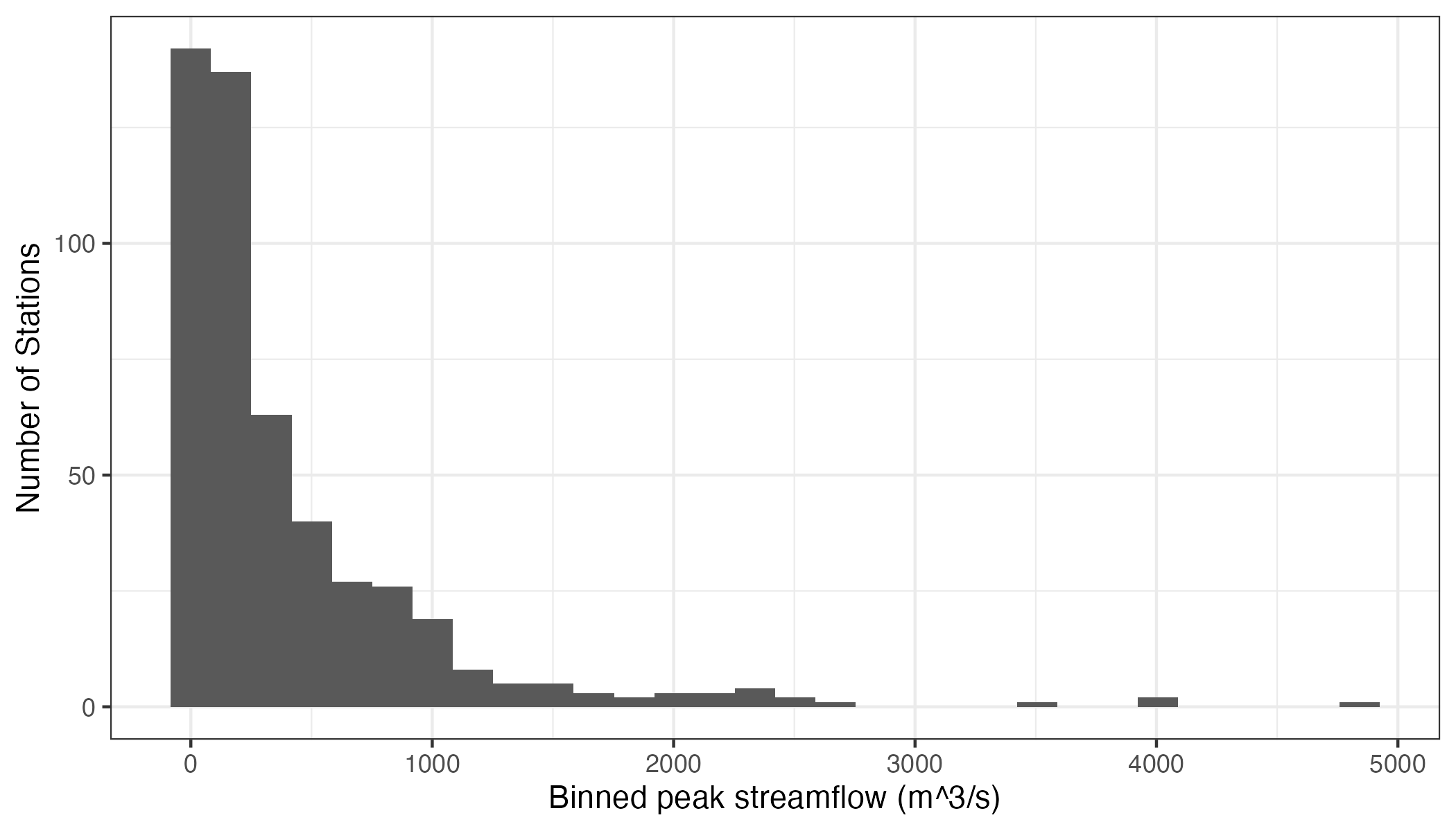
We can see that these data roughly resemble some kind of heavily3 right-skewed distribution. Now, let’s say we’re interested in mapping these data. We can do this quite easily using R:
library(tidyverse)
library(terra)
library(tidyterra)
library(colorspace)

us_states <- vect(rnaturalearth::ne_states(country = "United States of America", returnclass = "sf")) %>%
    project("EPSG:5070") %>%
    dplyr::select(postal) %>%
    dplyr::rename("state" = "postal") %>%
    dplyr::filter(!(state %in% c("AK", "HI")))

ggplot() +
    geom_spatvector(data = us_states,
        alpha = 1,
        linewidth = 0.5,
        fill = "white") +
    geom_spatvector(data = data,
        aes(color = largest_observation),
        size = 1) +
    scale_color_continuous_sequential(
        name = "Peak Q (m^3/s)",
        palette = "Viridis",
        rev = TRUE,
        limits = c(0, NA)
    ) +
    theme_void() +
    theme(
        legend.key.height = grid::unit(0.4, "in"),
        legend.key.width  = grid::unit(0.2,  "in")
    )
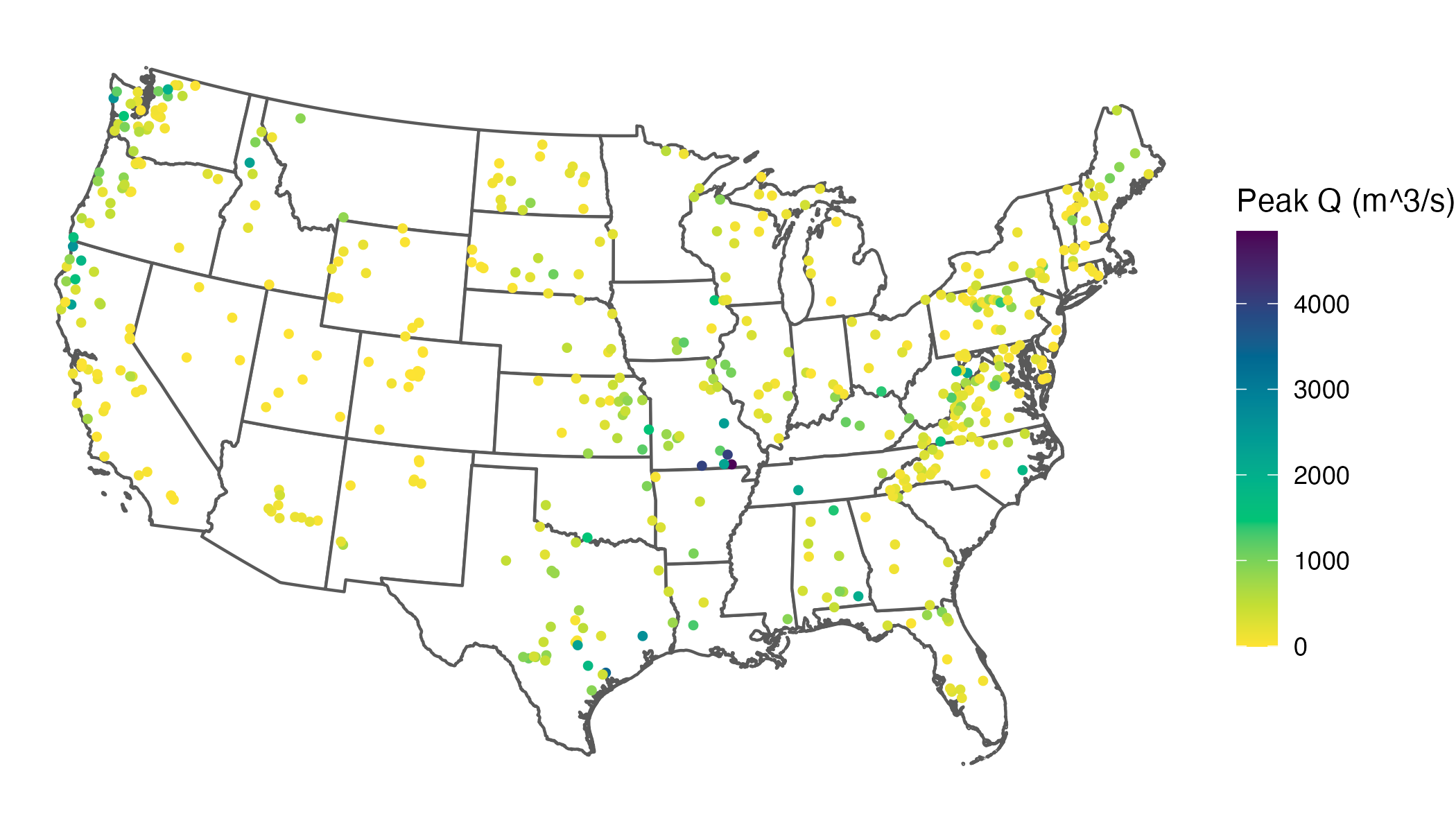
What might immediately jump out to you from this map is that our skewed distribution leads to a large number of values showing up in yellow (the bottom of our color scale), and progressively fewer showing up in green, blue, or purple. What this effectively does is cluster the majority of values in a narrow band of our color scale, which makes it difficult to differentiate among the stations clustered at the low end.
A common goal is to use the color scale efficiently so that the bulk of observations spans more of the available range, which improves visual discrimination among data points. In practice, real datasets rarely fill a color scale evenly, so this is a common issue.
I should note here that there are many different ways we could deal with this issue, including transforming the distribution of the data or using a more complex color mapping, and in some situations these are fine. However, I often avoid these strategies because they can reduce interpretability—especially on maps, where I prefer legends in the original units and a linear scale so equal numeric differences remain visually comparable. For this example, let’s prioritize distinguishing among the bulk of the data rather than among the largest values—in other words, the only thing we really need to know about the largest values is that they are large. Looking back at our histogram, the bulk of our values appear to lie between about 0 and 1,000 m^3/s.
An obvious solution here is to cap the color scale so the bulk of values use more of the available range, improving visual discrimination where most observations live. In ggplot2, you can do this by setting an upper limits value. The catch is that, by default, values outside the limits become NA for the scale and are drawn with na.value (often grey), which could be mistaken for missing data. Instead of dropping those values from the mapping, you can squish them: use oob = scales::oob_squish (or its alias scales::squish) so anything above the upper limit is mapped to the maximum color, and anything below the lower limit is mapped to the minimum color:
ggplot() +
    geom_spatvector(data = us_states,
        alpha = 1,
        linewidth = 0.5,
        fill = "white") +
    geom_spatvector(data = data,
        aes(color = largest_observation),
        size = 1) +
    scale_color_continuous_sequential(
        name = "Peak Q (m^3/s)",
        palette = "Viridis",
        rev = TRUE,
        limits = c(0, 1000),
        oob = scales::oob_squish
    ) +
    theme_void() +
    theme(
        legend.key.height = grid::unit(0.4, "in"),
        legend.key.width  = grid::unit(0.2,  "in")
    )
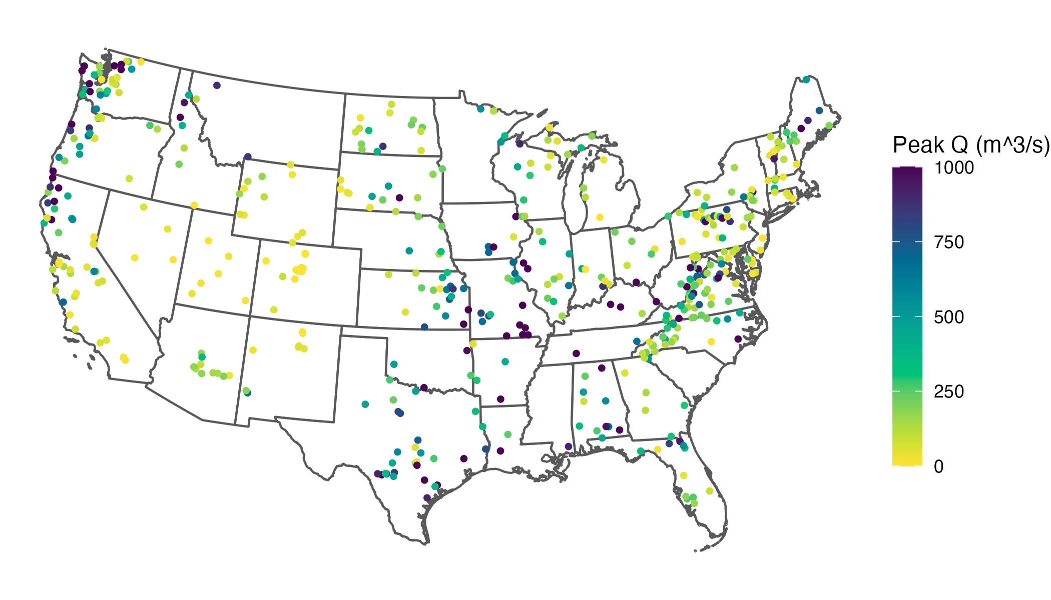
This clearly increases interpretability by spreading out our common values across the color scale. However, it also creates a new problem: once you squish out-of-range values into the limits, the legend no longer communicates that those colors include values beyond the endpoints. Without an explicit indicator, a reader can reasonably interpret the darkest color as “≈ 1,000” rather than “≥ 1,000” (up to 4,842, our largest value), collapsing the extremes into an indistinguishable category.
There’s an admittedly neat thing that Python’s matplotlib can do when you cap a color scale (i.e., you set limits but still want to signal out-of-range values). In plt.colorbar, you can use “extended” colorbars (triangular end caps) to indicate out-of-range values at one or both ends (see Figure 4 of this article for a real-world example). That would solve our problem elegantly: we keep better contrast for the bulk of the data while still communicating that some stations exceed the plotted maximum. But, sadly, this is not a native feature of ggplot2 :-(
Yes, we could switch to Python.4 But here’s the hard truth: I simply do not like matplotlib. I do not like it in the rain. I would not, could not, on a train. I will not use it here or there. I do not like it anywhere!
I know I could make equivalent plots using matplotlib, but I strongly prefer the syntax of ggplot2, and as such R will likely continue to remain my default for visualizations. So, I wanted to find a way to do this using R. Luckily, it’s quite easy. Enter the legendry package: guide_colbar()5 can add end caps automagically when (and only when) the data exceed your scale limits by specifying show = NA:
# install.packages("legendry")

ggplot() +
    geom_spatvector(data = us_states,
        alpha = 1,
        linewidth = 0.5,
        fill = "white") +
    geom_spatvector(data = data,
        aes(color = largest_observation),
        size = 1) +
    scale_color_continuous_sequential(
        name = "Peak Q (m^3/s)",
        palette = "Viridis",
        rev = TRUE,
        limits = c(0, 1000),
        oob = scales::oob_squish,
        guide  = legendry::guide_colbar(
          shape = "triangle",
          show  = NA,
          oob   = "squish",
          theme = theme(
            legend.key.height = grid::unit(2, "in"),
            legend.key.width  = grid::unit(0.2,  "in")
            )
          )
    ) +
    theme_void()
Voila—out of bounds, on purpose. Now your plot can focus on the bulk of the data yet stay honest about the extremes.
Big thanks to the developer of legendry. You made my day.
I do this for fun, but if you enjoyed reading this (and without ads!), consider buying me a coffee to help fuel my next post ![]()
Ok, two reasons… because every good blog post starts with an xkcd comic. ↩
Here’s a reprex you can play with since I haven’t provided you with my data. ↩
As I’m using this data to illustrate a visualization method, I’m intentionally not normalizing streamflow by watershed area, which would of course reduce the skewness of the distribution considerably. ↩
I use Python for a significant portion of my research (e.g., my machine learning model code), so this isn’t about “R vs Python,” which I believe to be an utterly pointless debate that nonetheless seems to persist. Part of why I often default to R is that I generally need to write significantly fewer lines of code in R than I would in Python to complete exactly the same task. But that’s not the only reason. If you’re interested in a deeper dive on why I believe R is objectively better than Python for data visualization, check out Edwin Thoen’s blog post on one of the features of R that makes it so powerful: non-standard evaluation (NSE). ↩
Note that while
oob = scales::oob_squishcontrols how out-of-range data are mapped to colors,guide_colbar(oob = "squish", show = NA)controls how the legend signals (and colors) the out-of-range end caps. You’ll typically want to use both. ↩